This Accordion Style FAQ module allows you to view the list of your frequently asked questions in your app.
A FAQ page is one of the most important and indispensable sections for business apps. Many businesses are often asked the same common questions over and over again by potential customers. Most online support teams spend hours of their precious time every day answering these general questions. Although it could have been easily avoided by putting a FAQ section in the app.
In addition to saving you a lot of pre-sales calls and support emails, clear up your prospect’s concerns and improve your customer experience by simply answering common questions immediately using the frequently asked questions.
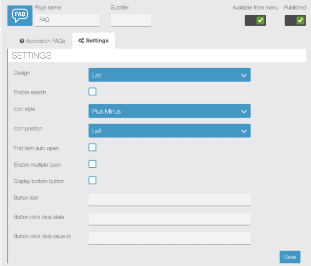
Module features:
- Add, edit and delete accordion elements.
- Drag and drop rearranges the positions of the accordion elements.
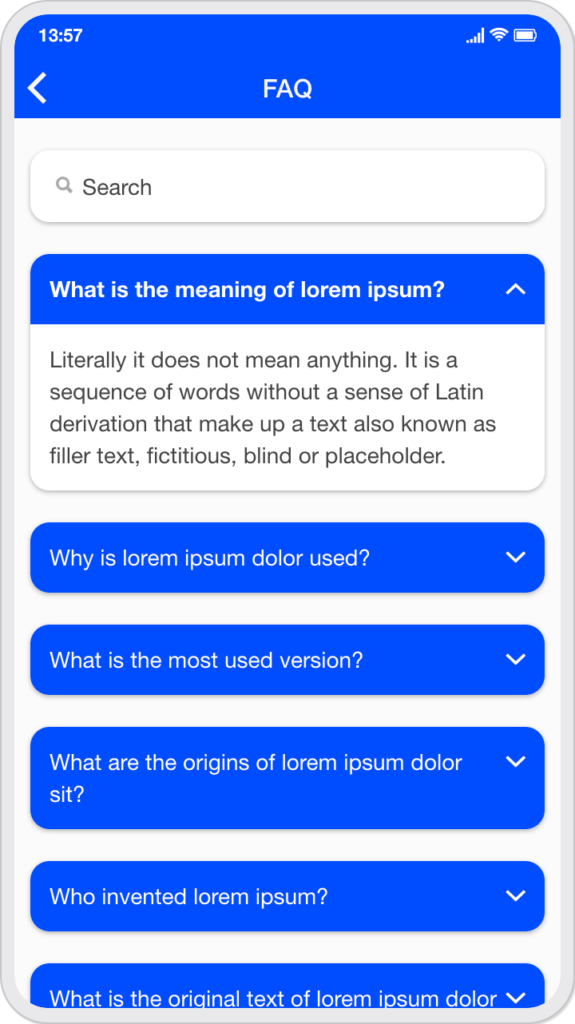
- Option to enable the search bar.
- Option to choose list or card design.
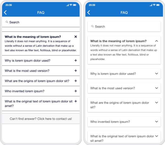
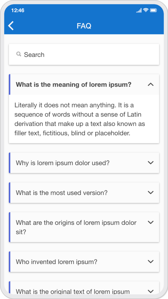
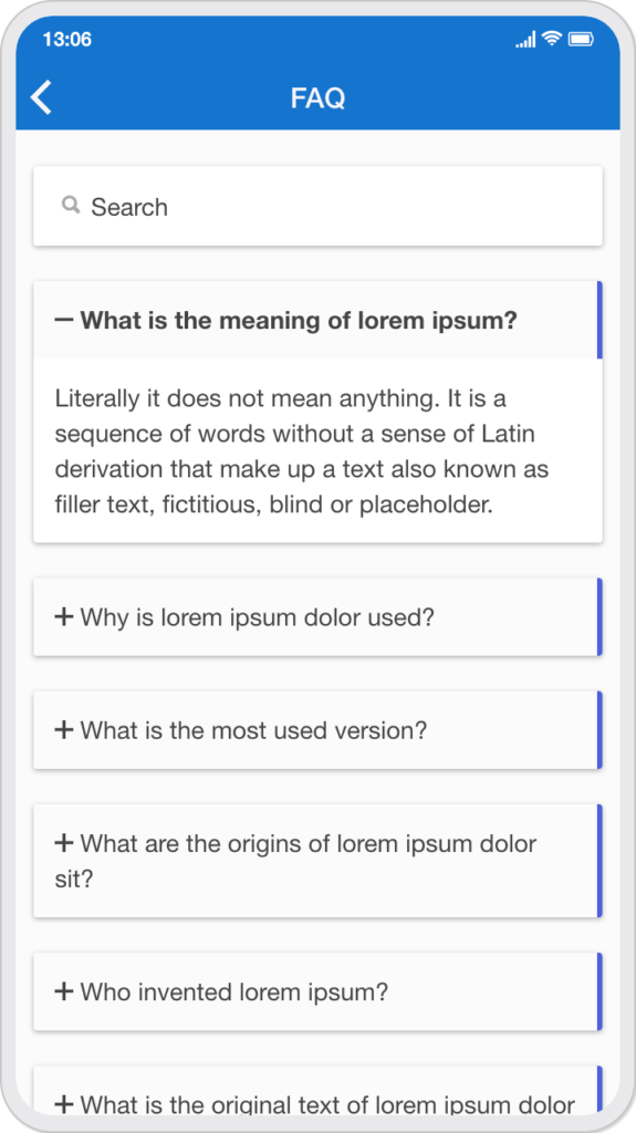
- Four icon style (plus-minus, closer-up, up-down-chevron, up-down-arrow)
- Option to choose icon position left or right.
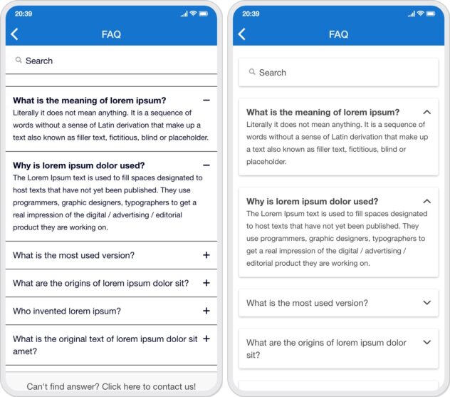
- Option to automatically open the first element of the accordion.
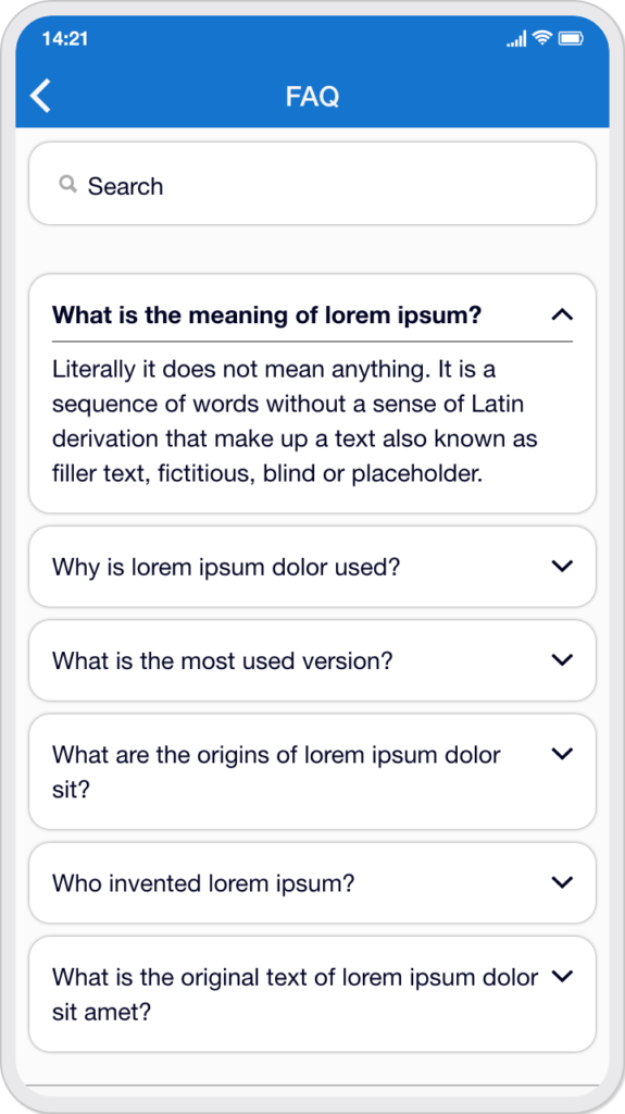
- Ability to open single or multiple accordions at a time.
- Option to display bottom button with text.
- Option to set in-app link to button below.
Editor screen:
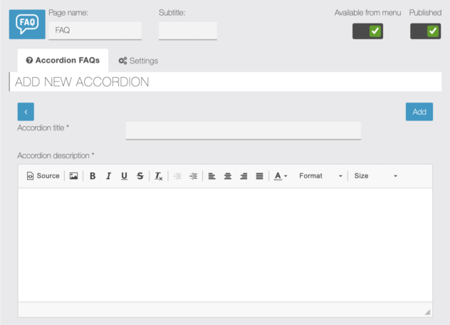
Add accordion:
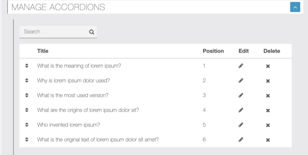
Manage accordions:
Settings:

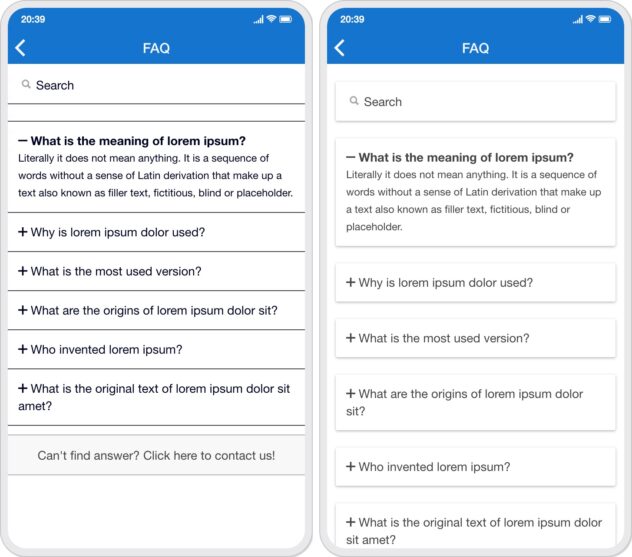
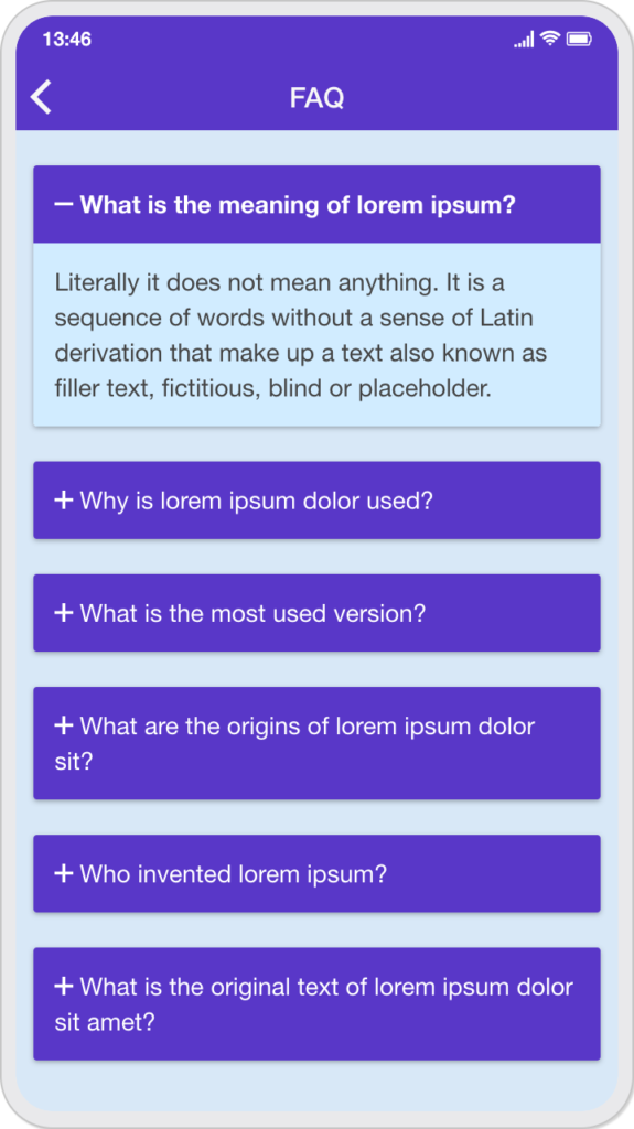
App screenshot:
Card Listing / Design:
Right icon:
More open:
What is the purpose of the button below?
You can use it as a contact button link, so if users can’t find their answer from the FAQ list, it will be very easy for users to contact you. You can link it to your app pages like contact page, custom page, source code page etc. Simply enter the data status and value ID of your in-app link there.
Suppose your in-app connection to be: <a Data-Offline=»rue hand-Params=»value_id:898 Instal
You can enter the contact display in the button click data status field and 898 in the button click data value ID field.
Examples of CSS code:
(1) Form background color:
.module-accordionfaq ion-content {background: # E0E5EC! important; }
(2) Change the background color of an active / open accordion:
.module-accordionfaq .list .item.item-custom.active {background: # f5f5f5; }
(3) Card design edge radius and box shadow:
.module-accordionfaq .card, .module-accordionfaq .button.button-custom {
    border radius: 12px;
    box-shadow: 0 3px 6px rgba (0, 0, 0, 0.16), 0 3px 6px rgba (0, 0, 0, 0.23);
}

.module-accordionfaq .button.button-custom {border-color: transparent; }
(4) Gradient background color for the bottom button:
.module-accordionfaq .button.button-custom {background: linear-gradient (45deg, # 7537E7 0%, # 35C9FF 100%); }
(5) Change the font size of the accordion description:
.module-accordionfaq .list .item.item-custom p {font-size: 14px; }
(6) Custom-1 style for card design with right icon:
.module-accordionfaq ion-content {background: #fbfbfb! important; }

.module-accordionfaq .card ion-item.item {fill: 0; }

.module-accordionfaq .item.item-custom .faq-title {
    background: #fbfbfb! important;
    left border: solid 3px # 4e63d7;
    padding: 12px;
}

.module-accordionfaq .item.item-custom p {
    padding: 12px;
    font size: 14px;
}
(7) Custom-2 style for card design with left icon:
.module-accordionfaq ion-content {background: #fbfbfb! important; }

.module-accordionfaq .card ion-item.item {fill: 0; }

.module-accordionfaq .item.item-custom .faq-title {
    background: #fbfbfb! important;
    right border: solid 3px # 4e63d7;
    padding: 12px;
}

.module-accordionfaq .item.item-custom p {
    padding: 12px;
    font size: 14px;
}
(8) Custom-3 style for card design without search bar and bottom button:
.module-accordionfaq ion-content {background: # d8e9f7! important; }

.module-accordionfaq .card ion-item.item {fill: 0; }

.module-accordionfaq .item.item-custom .faq-title {
    color: #ffffff! important;
    background: # 5938c8! important;
    padding: 12px;
}

.module-accordionfaq .item.item-custom p {
    padding: 12px;
    font size: 14px;
    background: # d1ecff! important;
}
(9) Custom-4 style for border radius card design:
.module-accordionfaq ion-content {background: #fbfbfb! important; }

.module-accordionfaq .card ion-item.item {fill: 0; }

.module-accordionfaq .item.item-custom .faq-title {
    color: #ffffff! important;
    background: # 004cff! important;
    padding: 12px;
}

.module-accordionfaq .item.item-custom p {
    padding: 12px;
    font size: 14px;
}

.module-accordionfaq .card, .module-accordionfaq .button.button-custom {border-radius: 12px; }
(10) Custom-5 style for listing design with edge radius:
.module-accordionfaq ion-content {background: #fbfbfb! important; }

.module-accordionfaq .list .item.item-custom {
    margin: 8px;
    border color: transparent! important;
    border radius: 12px;
    shadow-box: 0 0 2px # 808080;
}

.module-accordionfaq .item.item-custom p {
    upper padding: 5px;
    font size: 14px;
}

.module-accordionfaq .item.item-custom.active .faq-title {
    padding-bottom: 5px;
    bottom border: solid 1px # 808080;
}